Delving Deeper into Student Data Visualization with Program Analytics
In October 2017, I attended the presentation “Program Analytics”, led by Sameer Bhatnagar and Jonathon Sumner, held as part of the Ped Day activities at Dawson College. I came away from the session thoroughly impressed by Dawson’s learning analytics initiative. I contacted the workshop leaders in hopes that they would share their project details with the college network.
For the past few years, Sameer and Jonathon have been program coordinators within the Science program at Dawson College. As part of their roles, they had been working on finding answers to certain questions related to:
- Policy development and revision (e.g. how many students would be affected by a change in criteria for standing and advancement?)
- Academic trends (e.g. is grade inflation a problem for our department?)
- Operations (e.g. what percentage of students are historically repeaters for a course, and thus, how many textbooks should we order?)
They soon realized that other programs likely had the same questions and the answers were likely in the same trove of basic academic data. With this in mind, they decided to build a web-based platform that allows educational stakeholders to visualize large sets of data and manipulate it with filters, all within a web browser with no additional software to install.
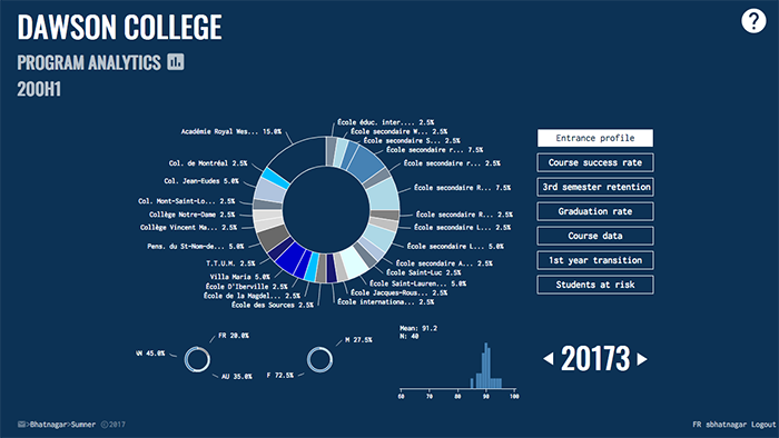
Screenshot from the Program Analytics Web App: A view of a typical program’s entrance profile, which shows the feeder schools, demographic breakdown, and distribution of Sec. V grades for an incoming cohort. The user can toggle the session selector, and see if there are trends over time for their program.
Can you tell us the history of the Program Analytics project and how it came about?
In our work with program committees, we noticed people were asking us a lot of questions about program-related trends. We decided to shift our focus away from finding answers to specific questions to providing a tool that would empower our colleagues to do their own research.
And so, starting in the winter of 2017, we decided to build a web platform to access information in a visual way.
We finished a prototype in the Spring of 2017 and showed it to our administration. They were enthusiastic and encouraged us to keep working over the summer on a polished application for the Fall. Dawson’s Ped Day in October was used to launch the tool internally and spread the word about its availability.
Why do you feel this project is important?
Colleges generate an enormous amount of data. Traditionally, we don’t do much with it beyond managing operations and extracting some Key Performance Indicators (KPIs). This project is a first step at trying to do more.
We both feel that it is by presenting the data in a visual way that you will begin to see the big picture and be able to identify the problems – things that are working and not working. If you are not looking at the data, you are flying in the dark.
When we do dig deeper, the traditional workflow is to produce a report which will be digested by the program committee and, if there are issues, task a person or sub-committee to get more data to help resolve these issues.
Due to limited time and resources, the data digging process involves 1 or 2 people, and often by the time any progress is made, the year changes, and a new report comes out. There is just too much data for one person to handle. The more eyes you have working on a problem, the more likely it is to get solved. Making the data accessible through a web-based platform is how we felt we would get more eyes on the problem.
What are some of the advantages of data visualization?
It might be a bit of a cliché, but a picture really is worth a 1000 words.
We are all familiar with spreadsheets and understand that data in its raw form has limited value. You have to make a graph or some other visual representation of the data to be able to identify trends or interesting patterns. The idea behind the application we have put together is that it allows users to manipulate and interact with data without having to do any of the tedious legwork.
To be able to identify meaningful trends, we tried to put as much information as possible in one spot with data from the last 5 years. There are a number of interesting views that may offer some insight into the student experience as well as the strengths and weaknesses of a given program. These range from interactive KPI views (e.g. course success rates, retention rates, graduation rates) where you can turn on and off a number of filters to static views of (e.g. the feeder schools of a program).
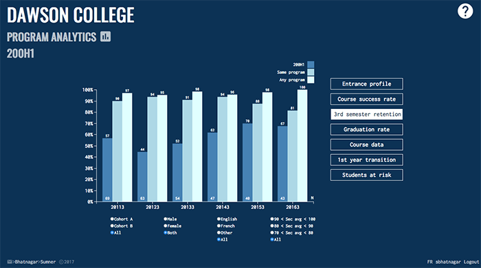
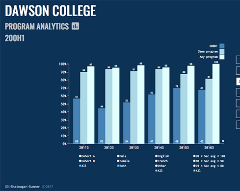
Another Screenshot from the Program Analytics Web App, visualizing a given Key Performance Indicator. The app leverages web-based tools to offer users additional context, interactivity and insight.
On your application’s home page, you evoke the image of students as stars in a galaxy gravitating around programs. Can you tell us a bit more?
The data is so voluminous and we spent part of our summer thinking about how we could represent the magnitude of the data in an aesthetic way.
It occurred to us that programs are like galaxies that students gravitate around. The landing page for our application is a snapshot of the database where the little points of light are students that cluster around programs. This view is actually an animation and you will sometimes see students switch their orbit, moving from one program to another. Although it was never intended as an analytical tool, watching the evolution of our college “universe” reveals which programs tend to lose students and which tend to attract them.
How will the data help educators at Dawson College?
Many colleges have a program with viability issues. In our case, one of our small programs had recently experienced lower than usual first-semester pass rates.
We used our data visualization application and saw that Calculus I was the sticking point for these students. Although the Calculus I course is composed of a mix of students from all over the college, we were immediately able to see that the students in this particular program were struggling more than their counterparts in similar programs. Knowing this, the program coordinator intervened to make sure students knew about available services provided by the Math Department, and encouraged students to pay special attention to this course because of the historical trend. Sometimes small actions like these are all that are needed to rectify a problem.
Every year, programs produce an annual report which identifies strengths, weaknesses and challenges. Our new tool helps to make this process continuous. And instead of tasking one person at the end of a program meeting to look into a problem and report back in a few weeks, we can now fire up the app during the meeting to try to make sense of what is happening and start brainstorming a solution.
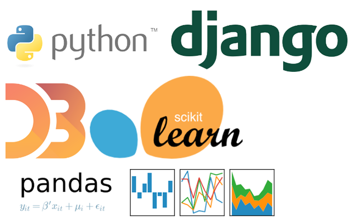
A collage of the free and open source software used as part of Dawson’s Program Analytics project
Can you tell us about your decision to use Open Source technologies?
We don’t think our project would have been possible 5 years ago. A major reason for that is that the quality of open source technology is now on par with proprietary counterparts. The documentation is often top-notch and many bigger projects are maintained by a large and dedicated community of developers. This allows anyone (who really wants) to learn things from scratch and yet produce feature-rich content.
Furthermore, our vision from the beginning has been to do something that, as far as we knew, had not been done before (at least in the specific context of the CEGEP network). This meant we wanted tools and a framework that would allow unfettered flexibility. Only open source technology allows this.
Our technology stack is based on tools from the Python ecosystem (Django as a web framework, Pandas for data manipulation, SciKit Learn for Machine Learning) plus the latest Web 2.0 technologies (HTML5, CSS and Javascript). Most of the visualizations are implemented with d3.js. Stitching together these technologies gives us everything we need to visualize and manipulate data queries over the web while ensuring secure access to the platform.
There is a misconception about where student data is hosted. Could you tell us more?
First and foremost, data security is very important. There is no personally identifiable information in the database we use, as all records are completely anonymized.
In terms of location, as with most colleges, Dawson hosts its academic database on site. As such, the College’s IT department is crucial to our work. They provide us with an anonymized mirror of just a subset of this database; only the data that is appropriate and required for the work that we are doing (e.g. admission, registration and graduation records). The raw data is only available behind the college’s firewall, and a login and password are required to access the app.
Have you planned other initiatives to extend the functionality of the data-visualization application?
We are currently working on integrating commenting into the app. Soon, each data visualization page will have a forum which can be used to leave notes and support discussions between members of program committees and other stakeholders.
We are also starting to create ‘living reports.’ These are short specialized reports that integrate live data and evolve as the data evolves, which can be particularly interesting for monitoring specific program trends over time.
Our long term goal is to leverage our expertise in Data Science to help colleges make more data-driven decisions, with the ultimate aim of maximizing the likelihood of student success. Something akin to “business intelligence”, but for the educational sector. And with recent advances in machine learning and artificial intelligence, we have some other ideas in mind!
An Invitation to the Network
Sameer and Jonathon would eventually like to explore aggregating data and developing partnerships across the CEGEP network. They have received an invitation to present their data visualization platform to the administrators at another Montreal-area college before the end of 2017. I asked them if they would be willing to meet with other colleges, and they are very excited to share with other colleges that invite them to speak.
Congratulations Sameer and Jonathon on the launch of your data visualization application and thank you for sharing your story with the college network!
About the Project Coordinators
Sameer Bhatnagar He is a Physics teacher and the Program Coordinator of the Explorations Science Program at Dawson. He is currently working on a PhD at the École Polytechnique, with a specialization in Educational Data Mining.
Jonathon Sumner He is a Physics teacher at Dawson, and is the Science Program Coordinator. He has a PhD in Mechanical Engineering, where his research expertise is in Computational Fluid Dynamics.
Click here to read the original article on ProfWeb. (CC-BY-NC-ND, Profweb)

